Wastewater Wednesday - 8/13/25
COVID is getting ready to go back to school. How are you getting ready to avoid it?
Let's get right to the data because the 💩 doesn't lie!
Wisconsin Data
Let's start with the Wisconsin data today because the next wave is coming in fast. Last week the statewide graph only showed a slight hint of an uptick, but this week you can clearly see it because the virus is starting to hit bigger sewersheds like Milwaukee:
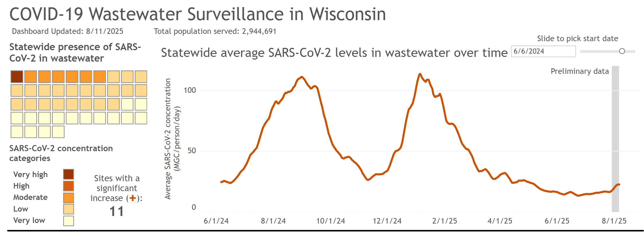
The eleven sewersheds showing a significant increase in the 8/11 data report are: Appleton, Eau Claire, Janesville, Lancaster, Marshfield, Menomonie, Milwaukee (Jones Island), Milwaukee (South Shore), Oconomowoc, Oregon, and Sheboygan. In addition, Brookfield, Green Bay, and WalCoMet (central Walworth County) are showing "Moderate" levels of transmission, although the final datapoints are not significantly higher than the previous one, hence the lack of a "significant increase" tag.
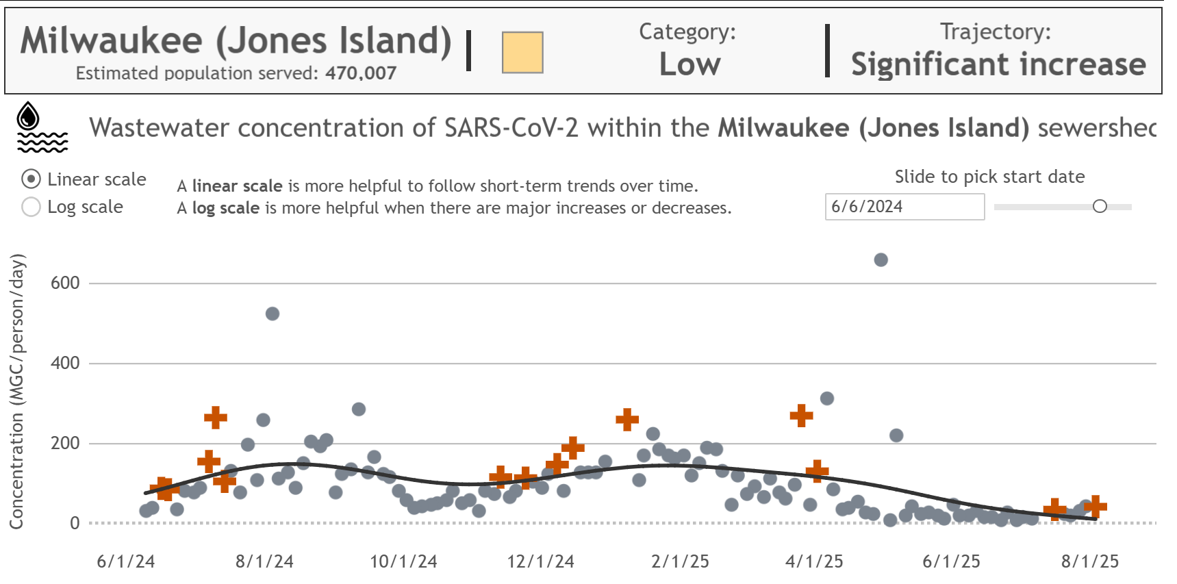
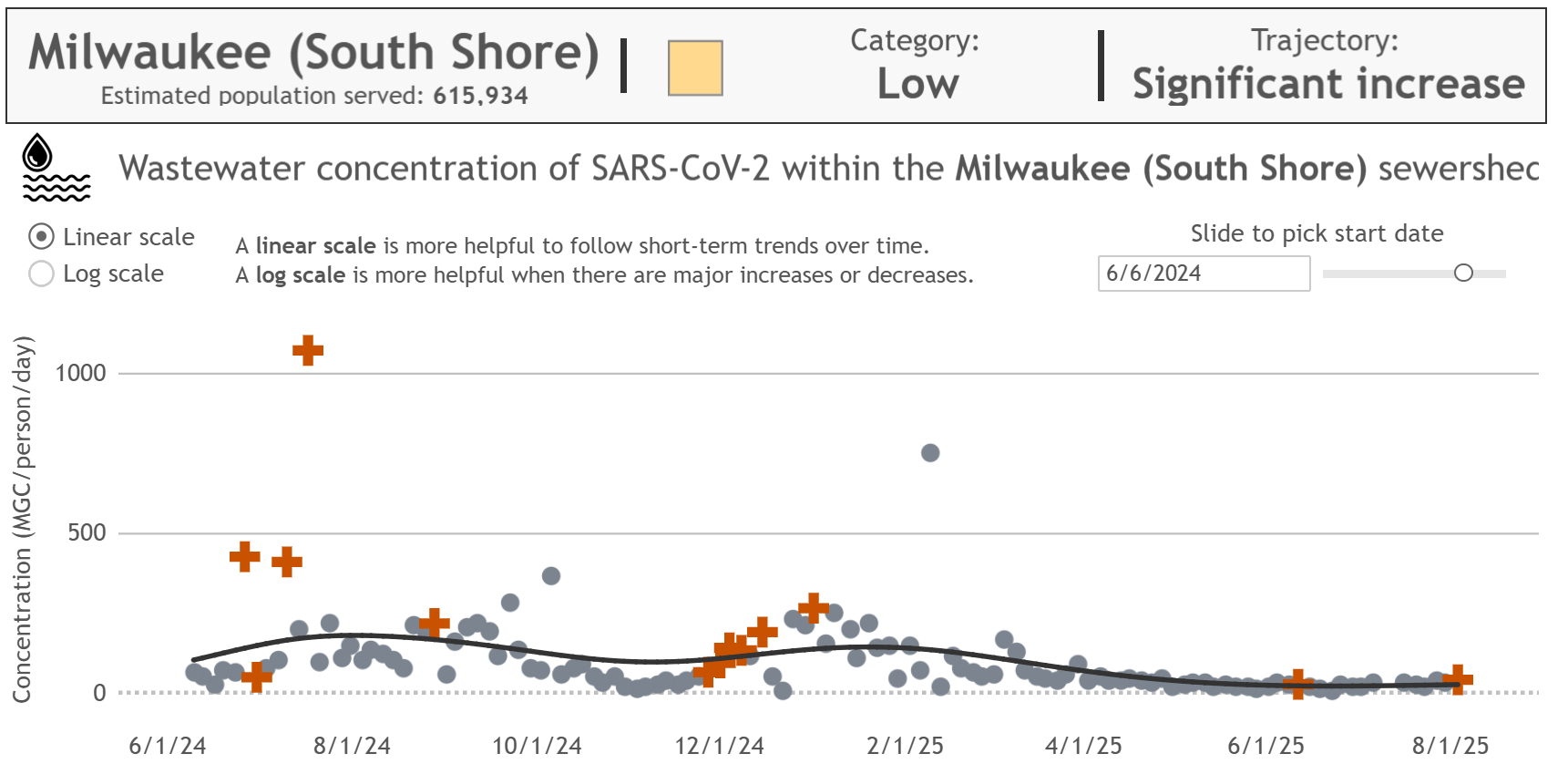
The increases in some of these sewersheds appear relatively small so far, but that can be deceptive. Exponential growth appears insignificant right up until it's not.
If you look at some of the sewersheds that were already on the upswing last week, you can see what I mean:
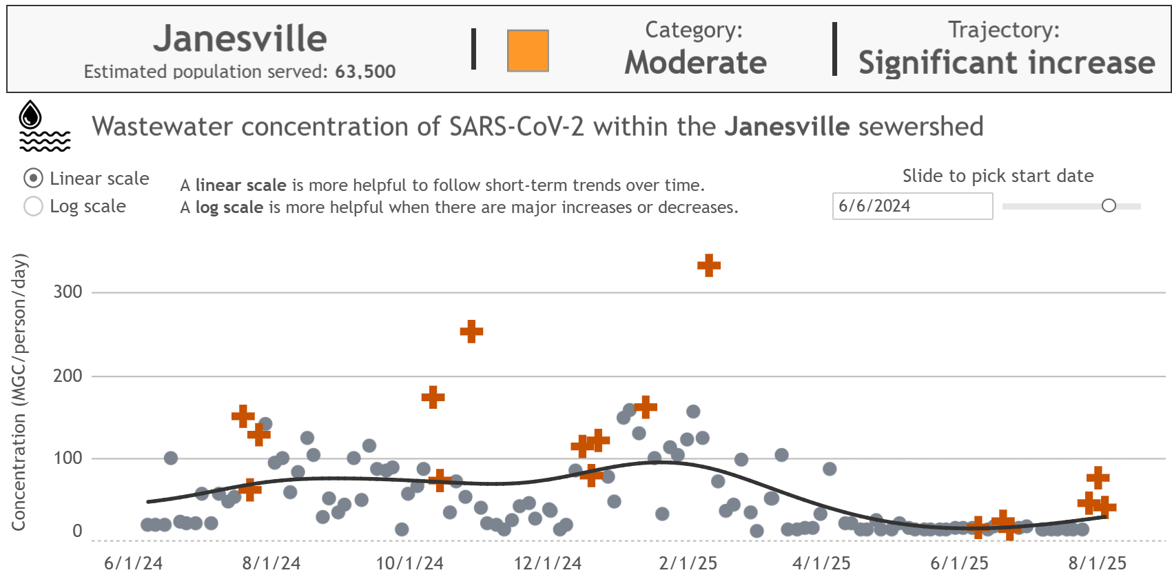
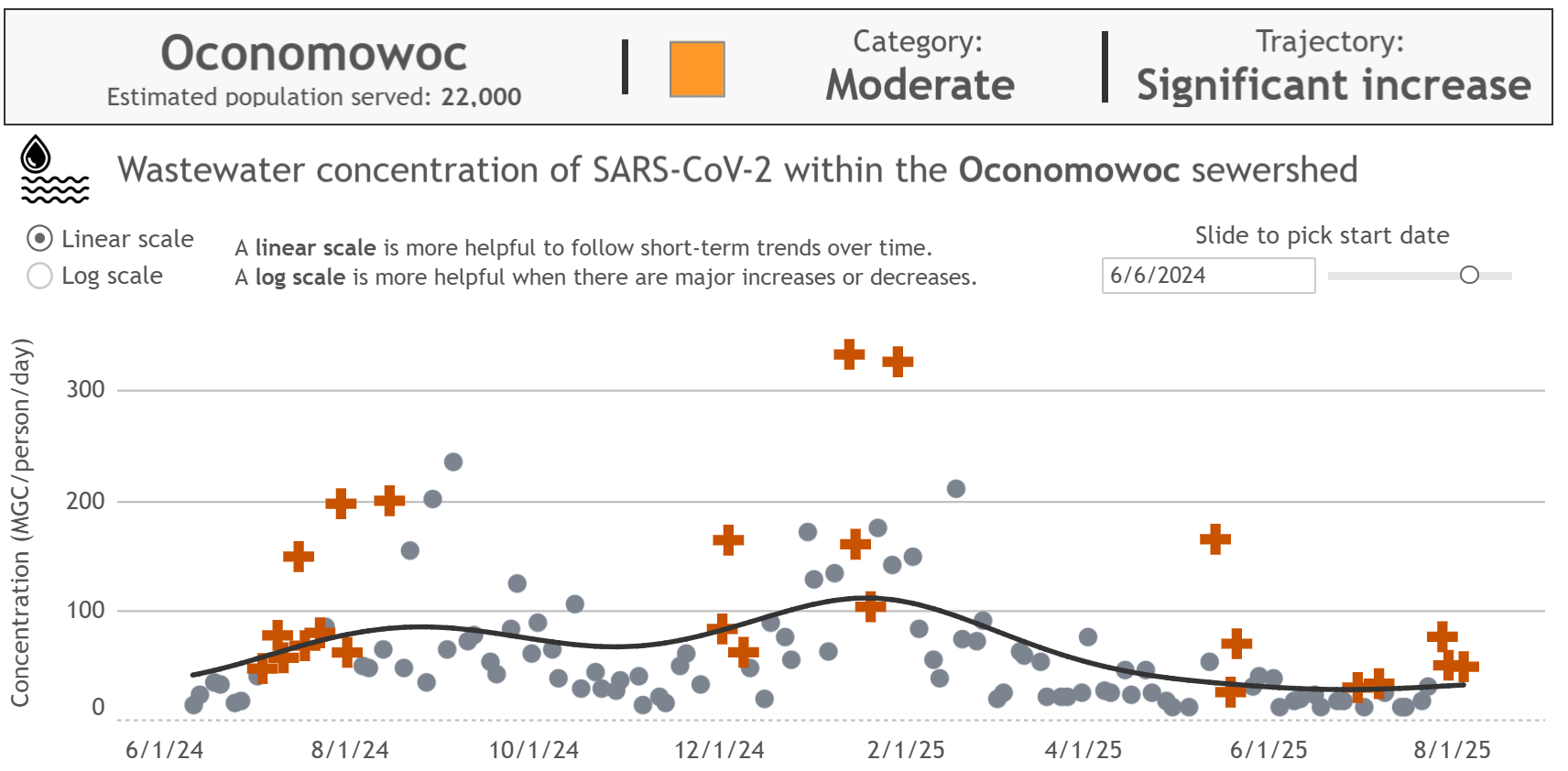
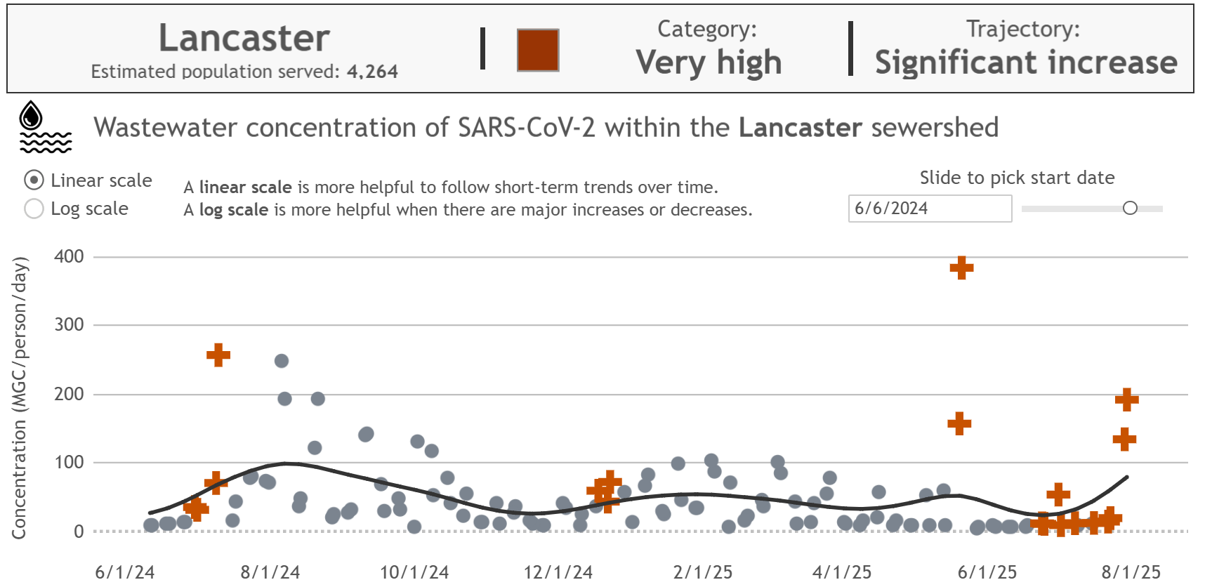
And now that students are moving back on to campus, we can expect to see increases in all the college towns (especially Madison) shortly, and that will spill over into the general population, just in time for K12 schools to start.
Things are not heading in a good direction, and with anti-science, conspiracy theorist grifters in charge of our national public health institutions, I fear things are going to get a hell of a lot worse before they get better.
National Data
Zooming out now to the national level, we can take a look at what's heading our way in the upcoming weeks.
Compared to last week, more of the country has entered "High" transmission levels, especially across the whole southern tier where schools are starting back up already.
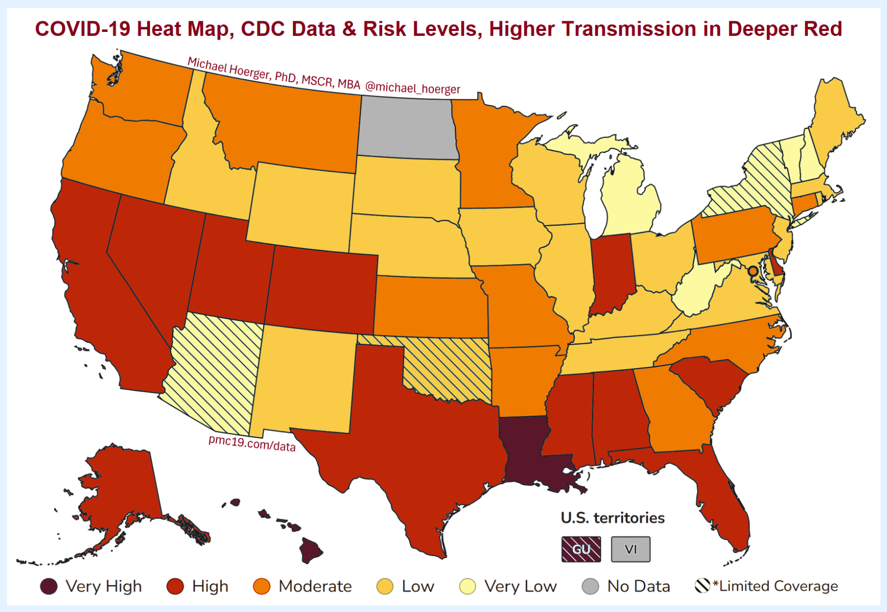
Of particular note is Louisiana, where an absolutely staggering 1 in 19 people are estimated to be currently infectious with SARS-CoV-2.
Compared to last week, this year's trendline is now looking closer to the fall '21-'22 (blue) wave than the fall '23-'24 wave, which seems better until you remember what happened that winter:
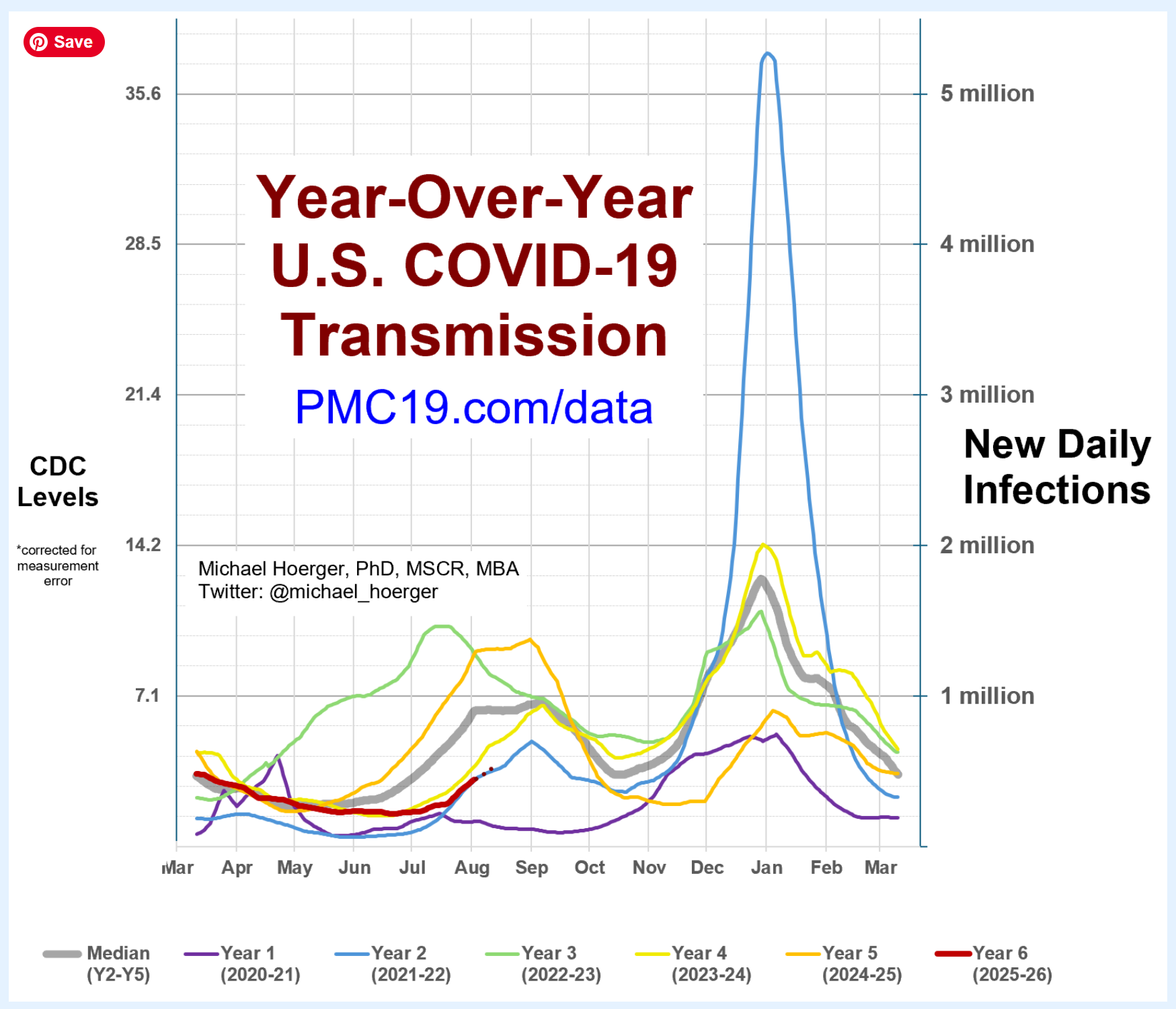
None of us can predict yet how high this winter's wave is going to be. It will depend greatly on just how much of an evolutionary advantage the newest crop of variants have, on whether or not we get updated COVID vaccines and if they get rolled out for the general population or not, and on what actions people take to protect themselves and their communities.
That last piece is key. These trends do not just happen to us, independent of our actions. The actions we take now, and in the coming weeks as the school year gets rolling, affect how bad the wave is going to be. Every chain of transmission we break by staying home when sick, by masking up in a well-fitting respirator, by testing regularly, by opening windows, by turning on air purifiers, by upgrading ventilation...every chain of transmission that we break in these ways slows the rate of growth and "flattens the curve".
A study in the journal Nature showed that if everyone had masked up in high quality respirators, COVID transmission would have been reduced by a factor of 9, which is enough to drive it into exponential decay. Pushing disease transmission into exponential decay, where each case causes less than one additional case, is how you ultimately eliminate a disease.
This is still true. If people would mask up in well-fitting respirators, we could massively drive down transmission.
"But nobody wears masks anymore! Just me masking up won't make a difference!"
Not true! Aside from the part where wearing an N95 or equivalent will absolutely protect you, small increases in the proportion of people masking also induce a social contagion effect, triggering more people to feel comfortable popping on a mask, AND, small increases in the proportion of people masking make a measurable difference in the amount of transmission happening.
Here's where I get to trot out my favorite study. Researchers looked at transmission in elementary schools and found that for each 10% increase in the proportion of people wearing a mask, there was a corresponding 47% decrease in the probability of a case of COVID in the next 5 days.
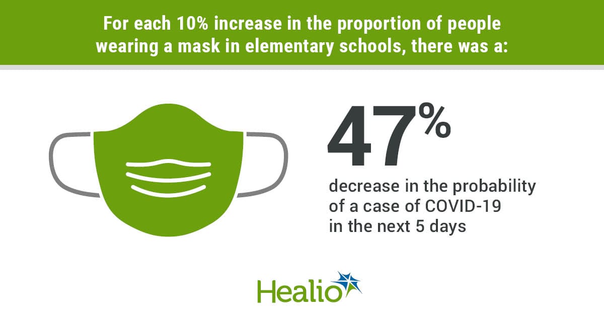
There were still plenty of people who weren't masking. But that small 10% increase made a difference.
What you, as an individual person, do matters.
Conclusion
The COVID pandemic isn't over. COVID is still out there, still causing potentially permanent, disabling damage, and still killing people. But you don't have to resign yourself to it. Add some high quality respirators to your back to school shopping list. Donate some to your kid's class or to the teachers at your kid's school. You can check out the Resources tab for shopping links, last week's post has coupons listed at the bottom, and I even have an exciting new coupon code to share. Flomask rarely has major discounts, but this year they have a 25% off back to school sale, going on now, with coupon code FAMILYFIRST. It applies to both their kid AND adult masks. You can also always reach out to me if you can't afford masks and I'd be happy to send you a few from my stash!
Stay safe out there, friends. Take care of yourselves and each other. It matters.